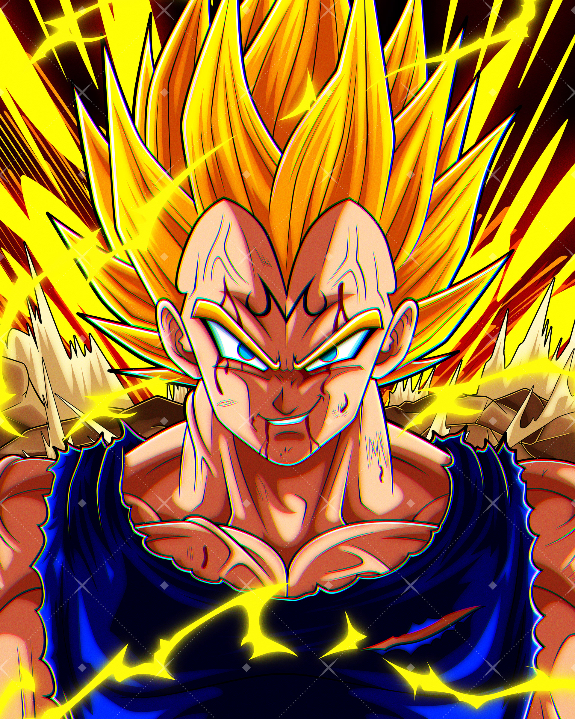
Naruto x My Hero Academia — Naruto & Mina Ashido | Vector Illustration
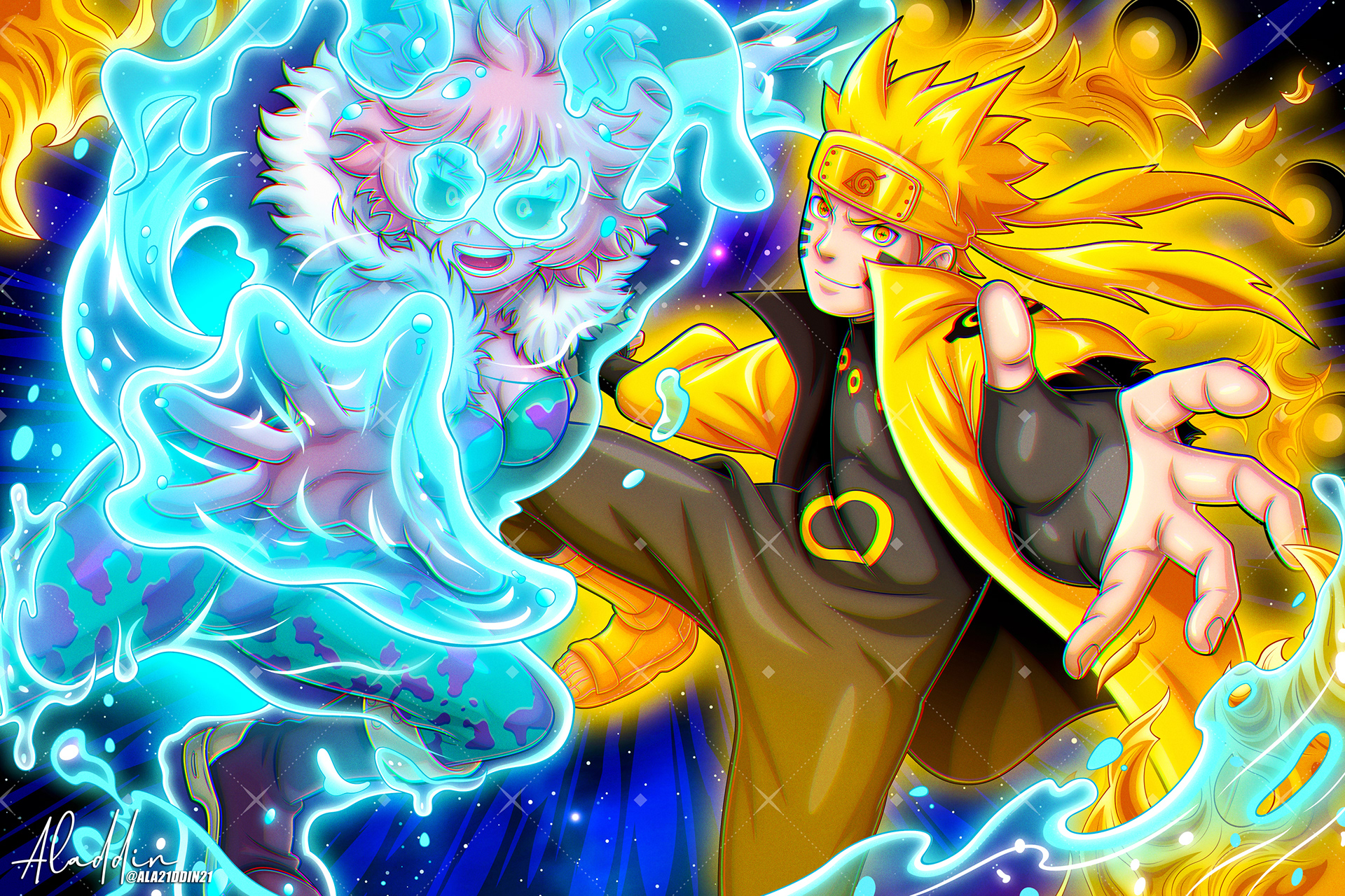
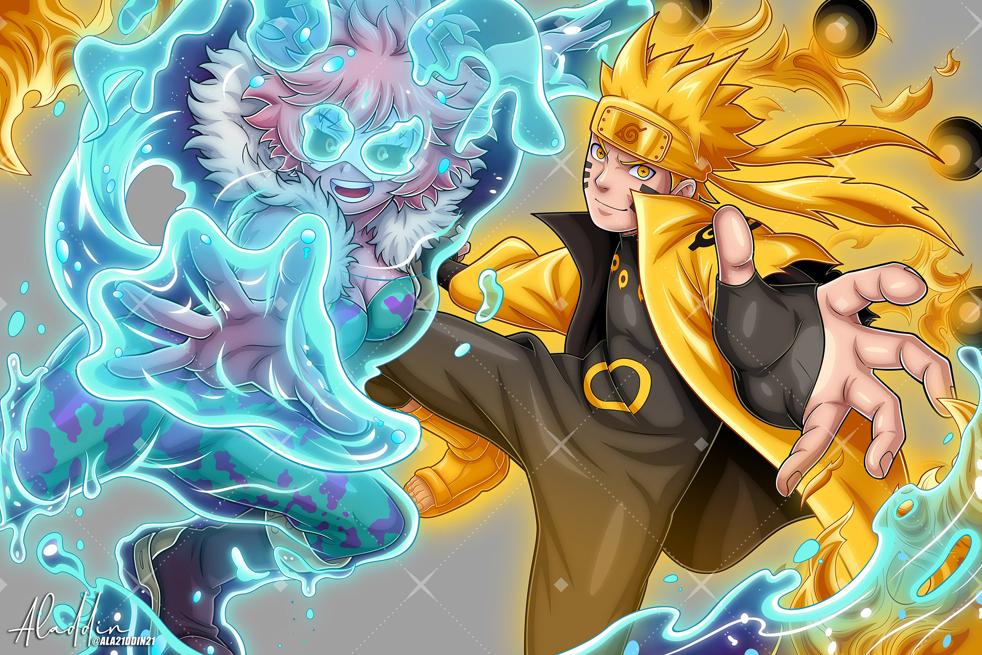
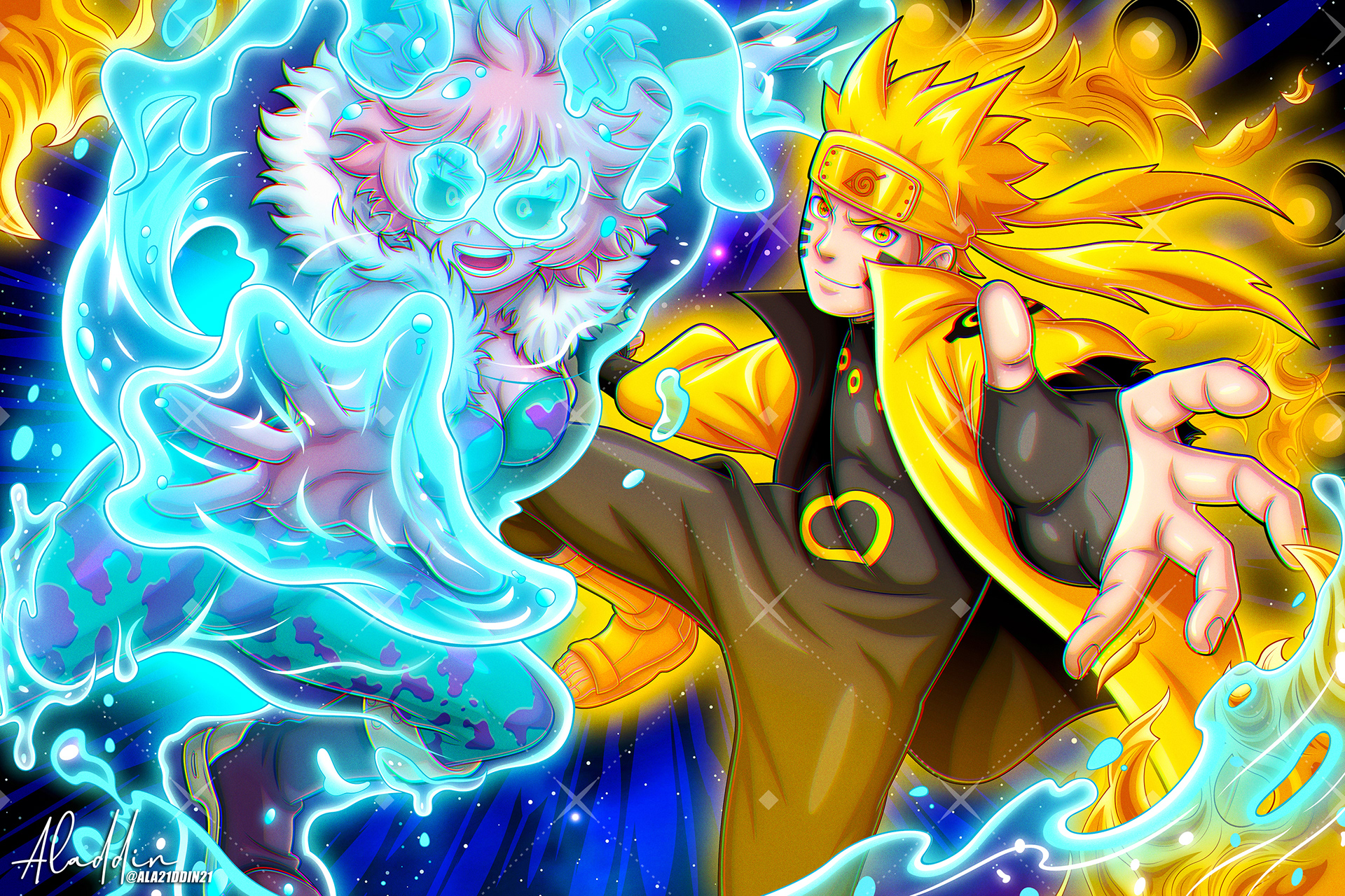
Executed as a high-octane crossover tribute, this piece focuses on the energetic, complementary dynamic between Naruto Uzumaki and Mina Ashido. The core design challenge was balancing Mina’s fluid, sweeping acid forms across the foreground while maintaining Naruto’s explosive chakra presence. Set against a high-saturation cosmic backdrop, the entire composition is engineered for large-format commercial printing and high-saturation display.
01 — VECTOR ARCHITECTURE & SILHOUETTE
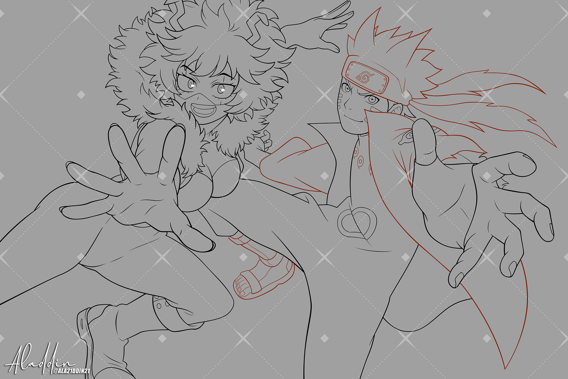
This phase focuses on pure draftsmanship and vector precision, utilizing clean, resolution-independent linework to guarantee sharp readability across both digital viewports and large-format physical prints. To immediately lock down the spatial depth of the composition, heavy line weights were strategically applied to the foreground elements, specifically anchoring Naruto's reaching hand and Mina's dynamic forward pose to pull them out from the background.
02 — CHARACTER RENDER & VALUE STRUCTURE
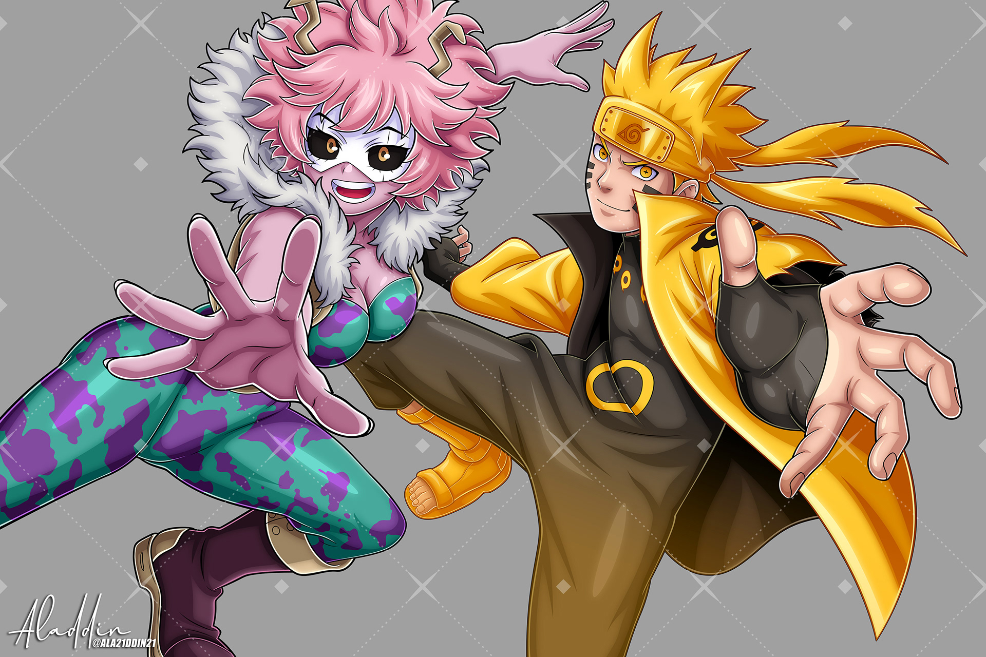
Establishing the core forms requires balancing saturated, warm skin mid-tones against deep, aggressive ink shadows. By meticulously locking in the flat base colors on both characters first, we ensure the creation of accurate, high-contrast shadows across their outfits before introducing any of the complex environmental lighting that could otherwise muddy the foundational structures.
03 — ELEMENTAL FX & WORLD-BUILDING
Injecting raw kinetic power into the scene requires a careful balancing act between Mina's ultra-saturated blue fluid energy and Naruto's golden-yellow chakra fire, ensuring neither character's silhouette is swallowed up by the intense effects. Layering these radiant, high-contrast elemental forces creates aggressive color temperature clashes that push the characters forward, granting the piece massive spatial depth and visual impact.
04 — ATMOSPHERIC LIGHTING & PRINT FINISH
The final compositing stage brings high-velocity speed lines, motion arcs, and subtle chromatic effects across the canvas to maximize the overarching kinetic energy of the crossover. Finally, the entire color grade is locked in to optimize value separation, ensuring striking contrast and vibrant color fidelity whether the illustration is viewed digitally or rendered on physical acrylic, metallic, or archival paper stock.
Thank you for viewing!
Follow for upcoming art / Commissions Open